Feminine gamification viewpoint: Websites appealing to both genders
Last week a report was published that depicted UK government website pages for not being ‘women friendly’ enough, the contentious site in question is this on https://www.greatbusiness.gov.uk/women-in-enterprise/. The report was written by a Lorely Burt a female enterprise ambassador and pointed out that only on the women in enterprise page case studies about women were found and the finance section was totally devoid from female examples. Now I think balance in examples on all pages is good, especially in general section that would appeal to both genders and the same goes for diversity.
Another point she made in the report was that the union flag made it look like a military recruitment site (supposing only men would want to join the military, I guess). She pointed out that language used throughout the site is very formal and statistical. The fact that a progress bar suggesting only 3 phases of business existing, may not cover the differences in the way women approach business and even for men it will not be the typical track for everyone, her point being that there is more than one way to start and grow a business and not everyone is interested in accelerated fast growth. Women are often starting lifestyle businesses suited around their family and life which may at a later stage then become the platform for growth or not.
So practically what can a company or government do to make the website more appealing to women assuming that the website already appeals and works for men. Women are more picky when it comes to easy of navigation and ease of finding what they are looking for. So my first suggestion would always be is to put the navigation to the test of a female audience. I recently looked at improving a community forum and conversations not threading and not organised in easy to find topics, were 2 small tweaks that did create a positive impact.
Women are leading the way on social and spend a lot more time on social media than their male counterparts, so the carry over from this is that recommendations and social informal tone are becoming more important. Testimonials from successful clients of all kinds of backgrounds in their words are recommendable. Photo-sharing is a ladies sport on social media, including appealing and appropriate images is a good thing to keep in mind for your website. You don’t have to recreate Pinterest, but having images is recommendable. Research also tells us a friendly looking face on the site looking straight at the reader will create a sense of empathy, because it is also typically how we engage in a face-to-face conversation.
On the topic of colour, choose multiple colours 2-4 and no it doesn’t have to be pink. But appropriate to the product or service is good. Monotone is not liked by most of us in a digital age and too much colour makes the messaging very confusing. When you choose colours look into the psychology behind it and what you are trying to achieve. A colour specialist I have worked with recommended one main colour and then 1 or 2 accent colours which also carry through in imaging.
Commenting and sharing are the key elements I give points to in the gamification of my website and the enabling elements to do this are omnipresent. I spent a bit of time making sure the site feels welcoming and friendly and at the same time information is easy to find.
What are your additional top tips for gender appealing web design?
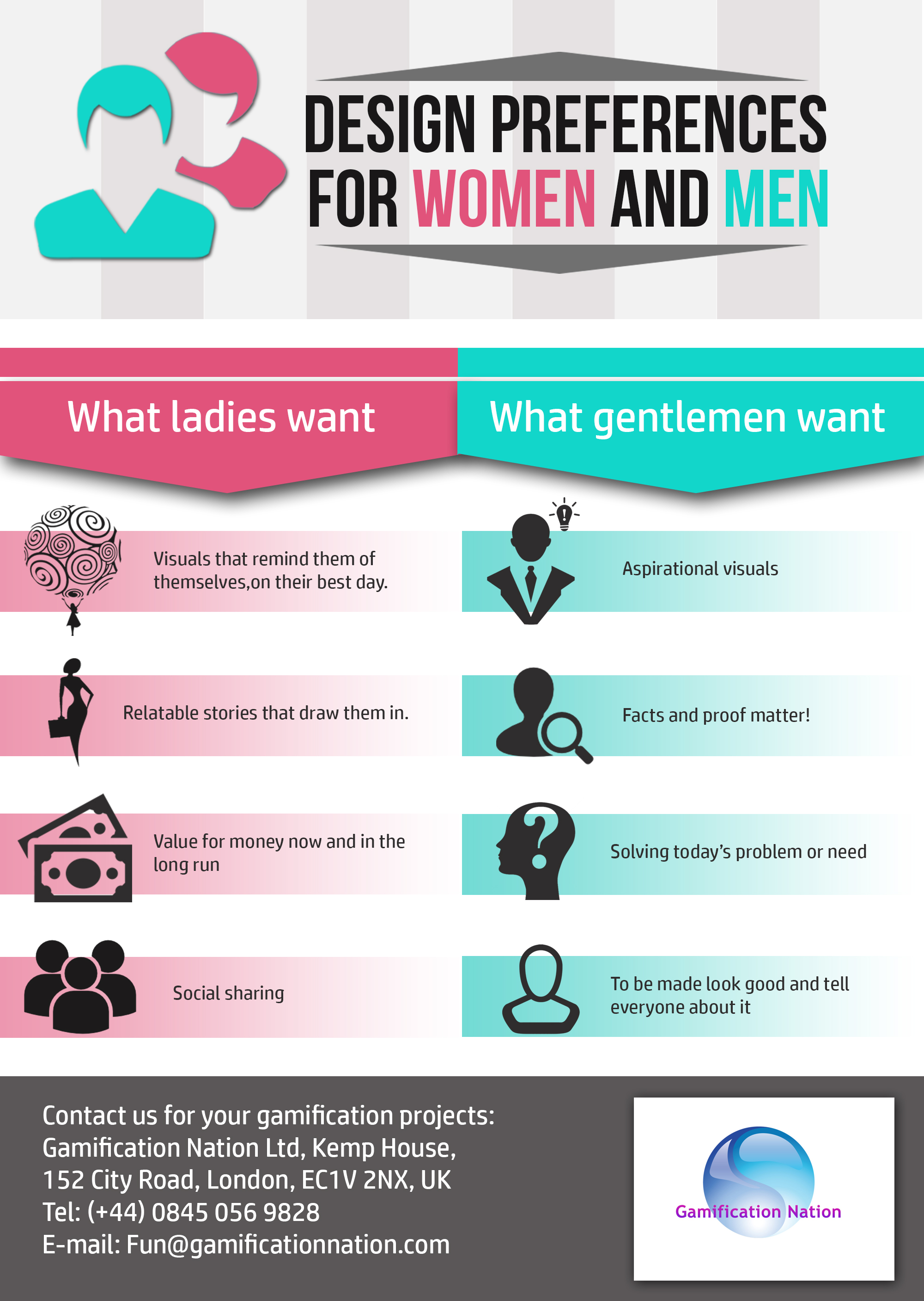
I have shared the infograpic before, but it seemed relevant for this post, so I have included it again.