Top tips on using graphics in gamification design

The saying a picture tells a thousand words is often used to describe the impact a graphical image can have over and above words. In our current media landscape, the visual and moving image is well and truly represented. Social media platforms Instagram and Pinterest are strictly image focused and give rise to memes and gif’s as well as allowing everyone to be a star on their own profile. Smartphones have in their own become a combination between a mini-computer and a camera with some ability to add special effects to your images. So it shouldn’t come as any surprise that visual media is on the increase.
For business communication, we still often see the written word as the main way to communicate. Although it is no longer rare to receive a business email with some emoticons built in. Marketing and advertising are the core exceptions to this statement, who have always had to rely on visuals for impact. The combination of the trend towards visual and decreasing attention spans is giving rise to an increased demand for visual imagery in gamification design as well. I would even go as far as saying that some enterprise tools are starting to look more like a game environment than a traditional computer application (thank goodness!).
Tip 1: Consider your platform
The first choices that you need make in graphical gamification design is to understand through what media your people will be accessing your design. Enterprise computers don’t have the same specifications as the latest 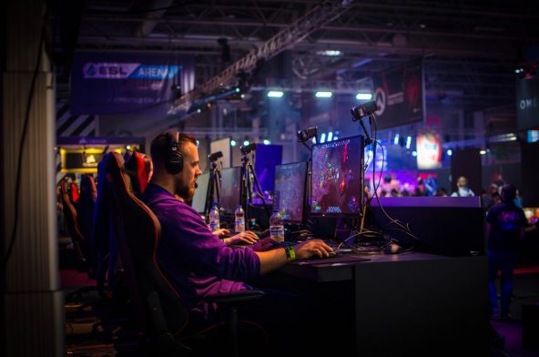 gamer PC in most workplaces, which by default means image sizing impacts the load factor of your application. Nobody will forgive you if they have to wait for your images to load in a world where time is money. It doesn’t mean that you can’t be creative or go all the way to 3D, it just means you need to keep file size and load in mind.
Graphical elements often have to sit within enterprise applications, so flat 2D images often work well for that reason.
Mobile devices for workers on the move often are the main mode of communication whilst travelling for work. Gamification can still work on the device but in this case, your maximum stretch is 2.5D when you want to create a 3D feel but only from one perspective. If you are graphics into mobile apps the request typically is to make them flat and interesting without needing additional perspective. Using potentially augmented reality as your additional dimension would make sense in some gamification work as long as it doesn’t compromise privacy and 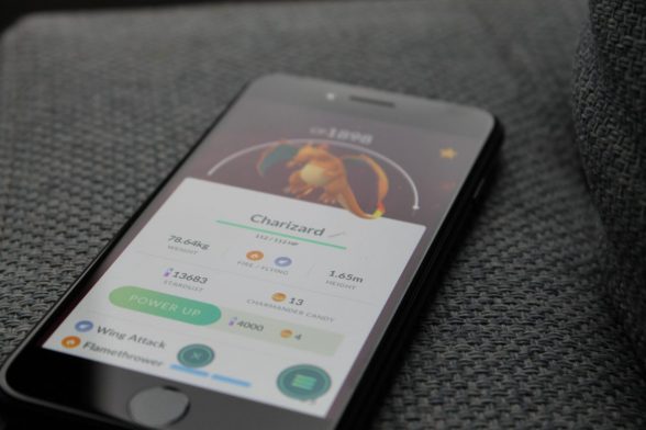 security regulations. This was highlighted by players of Pokemon Go sharing often secure locations where Pokemon had been hiding.
Pay attention to the needs of your gamification design for graphics and then the type of platform it will be deployed on. Web applications in offices are most common and in this scenario, you can have some freedom in the range of graphics used, you could even go as far as a virtual world as long as no firewalls need to be climbed. If the majority of the gamification design sits within existing enterprise applications or on mobile devices then I would recommend sticking with trusted 2D imagery which can still create the impact you want.
Tip 2: Consider the emotion
Images can conjure up emotions and knowing from the outset what you want to convey is important. It will drive the choice of colours, the shapes and the kinds of graphics that would also not be appropriate.
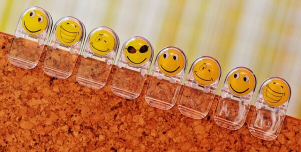
Just look at these three to see what I mean here 😉

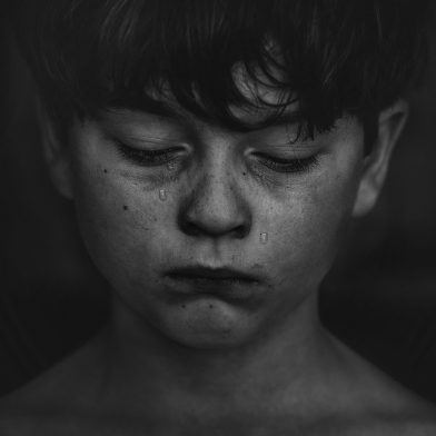

I think I can guess which one made you smile and which one made you wonder. All of them can work in the right context. The press works with images to shock and evoke emotions. No matter how immune we think we have become, images can be a very powerful means of expression and have often swung people into action. Just think about politics when a recent picture of a father and child not making it in a river crossing was the cause for further intense questioning of current policies. You may never have to go as far as this with images for workplace-related material, but at the same time used sparingly shock can be useful as a tactic to wake people up and make a difference. We have had a simple traffic light colour change in some of our designs as keys to driving behaviour adjustments.
If nothing else is available to you, even the simple style of emoticons works well on both mobile and desktop. and they can be added to most applications today without additional coding requirements, even if the image is still always better than the typed version 😉
Tip 3: Keep it consistent with your brand and culture or not!
The brand police in most organisations will be the first to come and tell you this, so the tip to consult the brand police shouldn’t be a surprise to those of us working within the corporate sector for a long time. You will find them in either corporate communications or marketing if you don’t have a brand ambassador tasked with keeping track on what is used or not. I remember being pulled back once for writing above a line on a slide deck and using pictures of real people.
Whether you stick with the brand or consciously break with it, should be a consideration for your gamification design. Sticking with the brand is a clear indication of business as usual, let’s keep it blended. If you want to shock people into change standing out from the crowd may be more appropriate.
If you look at LinkedIn, it is a good example of a very subtle and blended social media platform. Even their recent addition of emoticons sticks with the brand messaging of slightly more professional than social. Another example Classcraft, an educational platform aimed at teenagers, has a complete range of graphics, characters and is not miles away from recognisable games. Again both are totally appropriate for their audience and fitting with their branding.
Culturally some images are offensive and inappropriate, knowing where to draw the line is important. Picking a cross-section of images that represents the various races and gender in your organisation is in my view always recommendable.
Images can replace the need to translate text and transcend cultural boundaries. In most games, the core gameplay is represented in imagery, so that even people that don’t master the language can at least play. When you are in a multinational setting, this could be something to keep in mind which may make your gamification more accessible and provide some cost savings when no localisation is required. Graphics in gamification can be the language used to portray progress, achievement, consequences, etc.
Bonus tip: It doesn’t have to be a virtual world
 Some people in our line of work are promoting virtual worlds and virtual reality to make an impact. I believe it can and has a place. Yet not every system and not every gamified process fits this type of output. In learning a virtual world can create that safe lifelike place where you can test out new skills. Anywhere where practising on real systems entails a level of risk of safety, virtual worlds or virtual reality are highly recommendable.
When you have to get the job done on a regular enterprise platform however, then jumping in and out of a virtual world may just make the process more complex rather than enhance it. If the graphical interfaces complicate the process, then my advice is to keep it simpler.
https://gamificationnation.com/how-to-choose-between-a-game-or-gamification/